
Junior Generals Logo Design
Jackson Generals, 2011

The main Jackson Generals logo, which I used for inspiration in the first Junior Generals logo.

This was the first Junior Generals logo that I designed. I didn't like how vertical was and how the dog was still the main focus of the logo, rather than the words. It looked too much like the main logo, but at the same time, it wasn't fluid with the main logo because I had to add a "hat" on top to fit the JUNIOR in the logo.

One of the alternate Generals logo, just the script from the main logo. Thought it was better served as inspiration for the second draft/actual Junior Generals logo.

The Junior Generals logo that I ended up using. It just seemed simpler and more clean. It is more horizontal than vertical, which I can make more vertical if needed with the use of the Clubhouse Barbers (sponsor) logo above it.
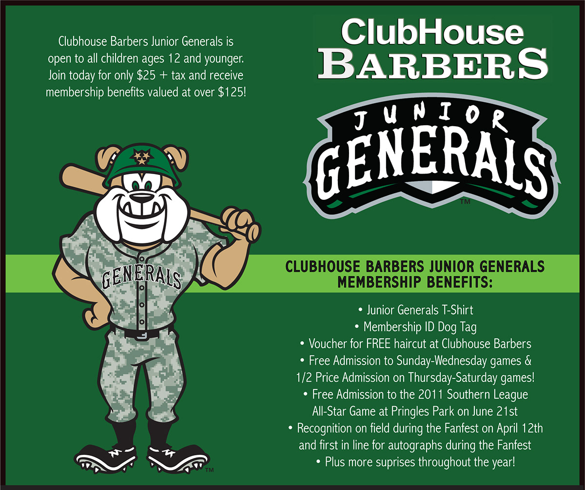
This was the top part of the Junior Generals flyer and also what is on the Jackson Generals website about the Junior Generals. I think it looked really clean with the greens that I used, along with Sarge, the Jackson Generals mascot.

Here is the logo used on the Junior Generals t-shirt that the kids received when they joined. [Note: This is just an example of the logo being used, I did not design the t-shirt.]


